How AI Reporting Dashboards Work
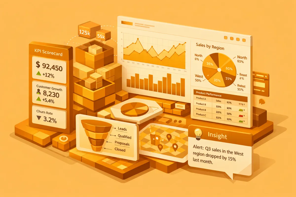
AI-powered dashboards connect to all your data sources and unify metrics under consistent definitions. Machine learning models analyze data continuously, detecting anomalies, trends, and correlations that static charts would never reveal. Natural language generation translates data patterns into plain-English summaries your entire team can understand. Instead of scanning 15 charts to find something interesting, your dashboard tells you: "Website conversion rate dropped 23 percent this week, driven primarily by mobile traffic from paid search campaigns. This correlates with the landing page changes deployed on Tuesday." The AI connects causes to effects and surfaces them proactively.
The underlying architecture works in three layers. First, a data integration layer pulls from every connected source on a schedule you define. Real-time for payment events and site traffic, hourly for ad spend and CRM updates, daily for financial batches. This layer typically runs on a warehouse like BigQuery, Snowflake, or Postgres, with Fivetran or Airbyte handling the extraction. Second, a machine learning layer builds statistical models of normal behavior for each metric and flags deviations. Seasonal-trend decomposition for metrics with weekly cycles, Prophet or ARIMA for trending series, isolation forests for multivariate anomalies. Third, a presentation layer generates visualizations, summaries, and alerts tailored to each user's role, often using a model like Claude or GPT-4 to turn structured findings into readable narratives.
The critical piece most teams underestimate is the semantic layer. Metrics like "active customer" or "gross margin" need a single definition that every query uses. Without it, the AI produces confident-sounding summaries that contradict each other. We build the semantic layer first, then build the models and views on top. That order matters. We deliver these as custom AI solutions designed around your specific KPIs, data sources, and decision-making workflows, often paired with a refreshed website design so leadership can surface the same numbers to the board without extra assembly.
Key Features and Capabilities
Anomaly detection. AI monitors every metric continuously and alerts you when values deviate significantly from expected patterns. No more discovering problems in a weekly review meeting. Issues surface in real time. A SaaS startup using AI anomaly detection caught a Stripe payment processing error within 2 hours that would have gone unnoticed for 5 days under their previous weekly review cadence, saving an estimated $18,000 in lost revenue. The model flagged it because failed-charge rate jumped three standard deviations above its 90-day baseline on a single card network.
Natural language insights. Machine learning generates plain-English summaries of data trends, anomalies, and correlations. Your dashboard reads like a briefing memo, not a spreadsheet. A CEO can open the dashboard at 7 AM and read "Revenue is tracking 12 percent above forecast this month, driven by a 34 percent increase in enterprise plan upgrades. Customer churn dropped to 2.1 percent, the lowest in 6 months." No chart interpretation required. For teams that still need the charts, the narrative links to the underlying visual so a skeptical CFO can drill in.
Predictive forecasting. AI models project key metrics forward based on current trends, seasonal patterns, and historical data. See where revenue, churn, costs, and other KPIs are heading before they arrive. Forecasts update daily as new data comes in, giving you a rolling 30, 60, and 90 day outlook that improves in accuracy over time. A good implementation shows prediction intervals, not point estimates, so your team understands the difference between "on track" and "within the margin of error." Mature dashboards reach mean absolute percentage error under 8 percent on monthly revenue within two quarters of deployment.
Root cause analysis. When metrics change, AI traces the change through connected data sources to identify likely causes. Revenue dropped because conversion rate fell because page load time increased because a new feature was deployed. This chain of causation would take an analyst hours to trace manually. AI surfaces it in seconds by correlating the change window with deploys, ad spend shifts, and traffic source mix.
Self-service exploration. Natural language querying lets anyone ask questions of the data: "What was our customer acquisition cost last month by channel?" The system generates the visualization and answer without SQL or dashboard building expertise. This eliminates the bottleneck of having one analyst who builds all the reports. The failure mode to watch for is hallucinated answers when the semantic layer is weak. A well-built system refuses to answer when the question is ambiguous rather than inventing a number.
Scheduled briefings. Configure daily or weekly email briefings that summarize the most important changes, trends, and action items. Your leadership team gets a 2-minute read every morning that replaces a 30-minute manual review. Our content marketing clients use this feature to track campaign performance across all channels in a single daily digest that lands in Slack at 6 AM local time.
Integration With Your Existing Tools
AI reporting dashboards connect to every system that generates business data. Salesforce, HubSpot, Google Analytics 4, Stripe, QuickBooks, Jira, Zendesk, Shopify, Klaviyo, Intercom, Mixpanel, Amplitude, and custom Postgres or MySQL databases all serve as data sources. Insights push to Slack, email, or Microsoft Teams so your team receives them where they already work. The integration pattern matters. Direct API polling works for low-volume, high-freshness data like Stripe charges. CDC replication through tools like Fivetran or Airbyte works better for high-volume operational data. Webhooks handle real-time events like form submissions or product activations.
Data flows from every source into a unified analytics layer, typically a warehouse like BigQuery, Snowflake, or Redshift for companies past 10 million rows per month, or Postgres for smaller operations. Real-time and batch pipelines handle different data freshness requirements. Your team accesses one dashboard instead of fifteen, with all metrics aligned on the same definitions and timeframes. The warehouse itself becomes a strategic asset. Even if you later replace the dashboard layer, your cleaned and unified data stays portable.
For businesses using multiple marketing platforms, dedicated marketing performance views consolidate Google Ads, Meta Ads, organic search, and email metrics into a single AI-analyzed dashboard. When the front-end reporting site needs to live outside the internal tool, we handle that through our web hosting and maintenance service so board and investor views stay fast and secure.
Building vs. Buying: When Custom Dashboards Win
Looker, Tableau, and Power BI are powerful visualization tools. They display data beautifully but do not interpret it. Adding AI features requires expensive add-ons and significant configuration. Tableau Pulse and Power BI Copilot have improved, but both still assume you have already built the semantic model correctly. They also require dashboard-building expertise that creates bottlenecks inside your team.
Custom AI dashboards interpret your data proactively. They know which metrics your CEO cares about versus your marketing director versus your operations manager. They surface the right insights to the right person at the right time. Here is a practical comparison:
| Capability | Off-the-Shelf BI | Custom AI Dashboard |
|---|---|---|
| Data visualization | Strong | Strong |
| Anomaly detection | Requires add-ons | Built-in, calibrated to your data |
| Natural language insights | Limited | Full, role-specific |
| Predictive forecasting | Basic or none | Custom models per metric |
| Root cause analysis | Manual | Automated |
| Setup time | 2 to 4 weeks | 8 to 14 weeks |
| Monthly cost at scale | $500 to $3,000 | $200 to $800 (hosting + maintenance) |
For businesses spending more than $2,000 per month on BI tools and still relying on manual analysis, custom builds often deliver better insights at lower long-term cost. The break-even typically falls around month 14, after which the custom system is pure savings.
Real-World Use Cases
E-commerce. An online retailer connected Shopify, Google Analytics, Meta Ads, and Klaviyo to a single AI dashboard. The system detected that their top-performing product category was trending downward 3 weeks before it showed up in monthly reports. They adjusted ad spend and inventory early, avoiding $40,000 in excess stock. The same dashboard flagged a return-rate spike on one SKU within 48 hours of the defect appearing, letting them pull the listing before chargebacks compounded.
SaaS. A B2B SaaS company unified Stripe, HubSpot, Intercom, and product analytics into one view. The AI identified that customers who used a specific feature within their first 7 days had 3x higher retention. This insight reshaped their onboarding flow and reduced churn by 18 percent. The forecasting module also caught a slowdown in enterprise expansion revenue a full quarter before the sales team reported it, which gave the CFO time to adjust hiring plans.
Professional services. A consulting firm connected their project management, time tracking, and invoicing systems. The AI flagged projects heading toward budget overruns 2 weeks before they hit, giving project managers time to course-correct. Profit margins improved by 8 percent in the first quarter. The same system surfaced that one partner's projects ran 22 percent over budget on average, a pattern nobody had noticed because each project looked fine in isolation.
How to Evaluate Your Options
Before you commit to building, answer five questions. First, what decisions will the dashboard drive? If you cannot name three specific decisions the dashboard will improve, you are not ready to build. Start with the decision, not the data. Second, who owns the definitions of your core metrics? If the answer is "it depends who you ask," your first milestone is a semantic layer, not a visualization. Third, how much historical data do you have, and is it clean? Six months of usable history is the floor for anomaly detection. Twelve months is the floor for forecasting that handles seasonality. Fourth, what is your budget for year one, including build and run? A realistic number for a 5-source build lands between $30,000 and $80,000 all-in. Fifth, who owns the system after launch? An AI dashboard without an internal champion drifts within 90 days.
Companies that answer these questions honestly tend to succeed. Companies that skip them end up with an expensive dashboard that nobody opens after the launch meeting. If you are still forming the answers, a scoped 2-week discovery engagement produces a real build plan without committing to the full implementation.
Frequently Asked Questions
How much does an AI reporting dashboard cost to build?
Custom AI reporting dashboards range from $15,000 to $65,000 depending on the number of data sources, complexity of analytics, and depth of AI features. Businesses connecting 3 to 5 data sources with standard metrics fall on the lower end. Enterprise implementations with dozens of sources, custom ML models, and role-based dashboards require more investment. Ongoing hosting and maintenance typically runs $200 to $800 per month, with warehouse compute being the largest variable cost.
How long does implementation take?
Most AI dashboard projects launch within 8 to 14 weeks. Data source integration and pipeline development take 3 to 4 weeks. Dashboard design, AI model development, and insight generation logic require 4 to 6 weeks. Testing and refinement with your team complete the timeline. You will have a working dashboard with basic AI insights within the first 6 weeks.
What data do I need to get started?
You need access credentials for your key business systems including CRM, analytics, and financial software, plus a clear list of the KPIs and metrics that drive your decisions. Historical data from each system provides the training foundation for AI models. At minimum, 6 months of historical data enables meaningful trend detection and forecasting. Twelve months gives the models enough data to account for seasonal patterns and year-over-year comparisons.
Will this replace my existing BI tools?
It can complement or replace them. If your team uses Looker or Tableau primarily for static dashboards, custom AI dashboards offer a significant upgrade. If you have complex existing BI infrastructure with many users, we can layer AI capabilities on top by reading from your existing semantic model. The goal is to reduce the time between data and decision, regardless of the approach.
How do I measure ROI from AI reporting dashboards?
Track time saved on report creation and review, typically a 60 to 80 percent reduction. Measure speed of anomaly detection in minutes versus days. Track decision response time, meaning how quickly your team acts on insights. Quantify the business impact of faster decisions in revenue saved or captured. Also measure the reduction in data request tickets to your analytics team. Most businesses see clear ROI within 3 to 4 months through operational efficiency and faster decision-making.
Can the dashboard handle data from custom or proprietary systems?
Yes. If your system has an API or can export data in structured formats like CSV, JSON, or direct database connections, we can integrate it. We have built connectors for custom ERPs, proprietary CRMs, legacy databases, and industry-specific platforms. Our AI integration services team specializes in building these integrations for systems that lack standard connectors.