How We Build UI/UX Design for Humboldt Park
Research comes before design. For a Humboldt Park project, research means understanding the actual user: what devices they are on, what language they prefer, what they are trying to accomplish, and what barriers the current interface creates. For organizations serving the community along Division Street, this sometimes means conducting user research in Spanish, testing on the mid-range Android devices that are common in the neighborhood, and recruiting testers who reflect the actual demographic of the user base rather than assuming that a younger, tech-comfortable audience will do.
From research we build a clear picture of the user journeys that matter most: the tasks that users are trying to complete and the points where the current experience breaks down. For a nonprofit managing event registrations, that might be the registration form flow. For a restaurant, it might be the mobile menu and the click-to-call path. For a health center, it might be the new patient intake process and the appointment booking flow. Design effort concentrates on the journeys with the highest frequency and the highest stakes.
Visual design follows interaction design. The wireframes establish the information hierarchy and the interaction patterns before color, typography, and imagery are added. This prevents the common failure mode where a visually attractive design is approved and then revealed to have navigation problems that are difficult to fix without breaking the aesthetic. For bilingual interfaces, both Spanish and English versions are wireframed simultaneously so the layout accommodates the text length differences between languages rather than being retrofitted after the fact.
Industries We Serve in Humboldt Park
Community health centers and clinics along North Avenue have digital experiences where UX quality has direct health outcomes. A patient who cannot find the intake form does not complete it. A patient who cannot navigate the appointment scheduling interface does not book the appointment. We design health center interfaces with accessibility, bilingual parity, and low-literacy users as first-class design requirements, not accessibility add-ons.
Cultural nonprofits and arts organizations near the National Museum of Puerto Rican Arts and Culture manage digital presences that serve multiple distinct user types: donors, members, event attendees, volunteers, and researchers. A single website navigation that tries to serve all five groups simultaneously often serves none of them well. We design information architecture and user journeys for each primary user type, tested against real users from the community the organization serves.
Puerto Rican restaurants and food businesses on Division Street and Western Avenue need mobile-first interfaces that accomplish a short list of tasks quickly: display the menu clearly, make the phone number easy to tap, show hours and directions without friction, and complete a reservation or catering inquiry in three steps or fewer. Restaurant UX fails when it is designed for a desktop or prioritizes visual appeal over task completion.
Community advocacy organizations near Roberto Clemente Community Academy use digital interfaces for petition collection, event registration, volunteer sign-up, and constituent communication. The UX of an advocacy platform determines whether community members complete actions or abandon them. Form length, progressive disclosure, and clear confirmation messaging all affect completion rates in ways that are measurable and improvable.
Independent coffee roasters and specialty retailers near Pulaski Road use e-commerce UX to convert browsers into buyers. Product discovery, cart behavior, checkout friction, and the mobile payment experience all directly affect revenue. E-commerce UX that was designed once and never tested since is almost always leaving conversion rate on the table.
Small grocers and food retailers along California Avenue often have online storefronts that were set up quickly without UX consideration. Navigation that buries popular products, search that does not surface relevant results, and checkout flows that require account creation before purchase are common failure patterns. We audit and redesign these interfaces with conversion rate and mobile experience as the primary improvement targets.
What to Expect Working With Us
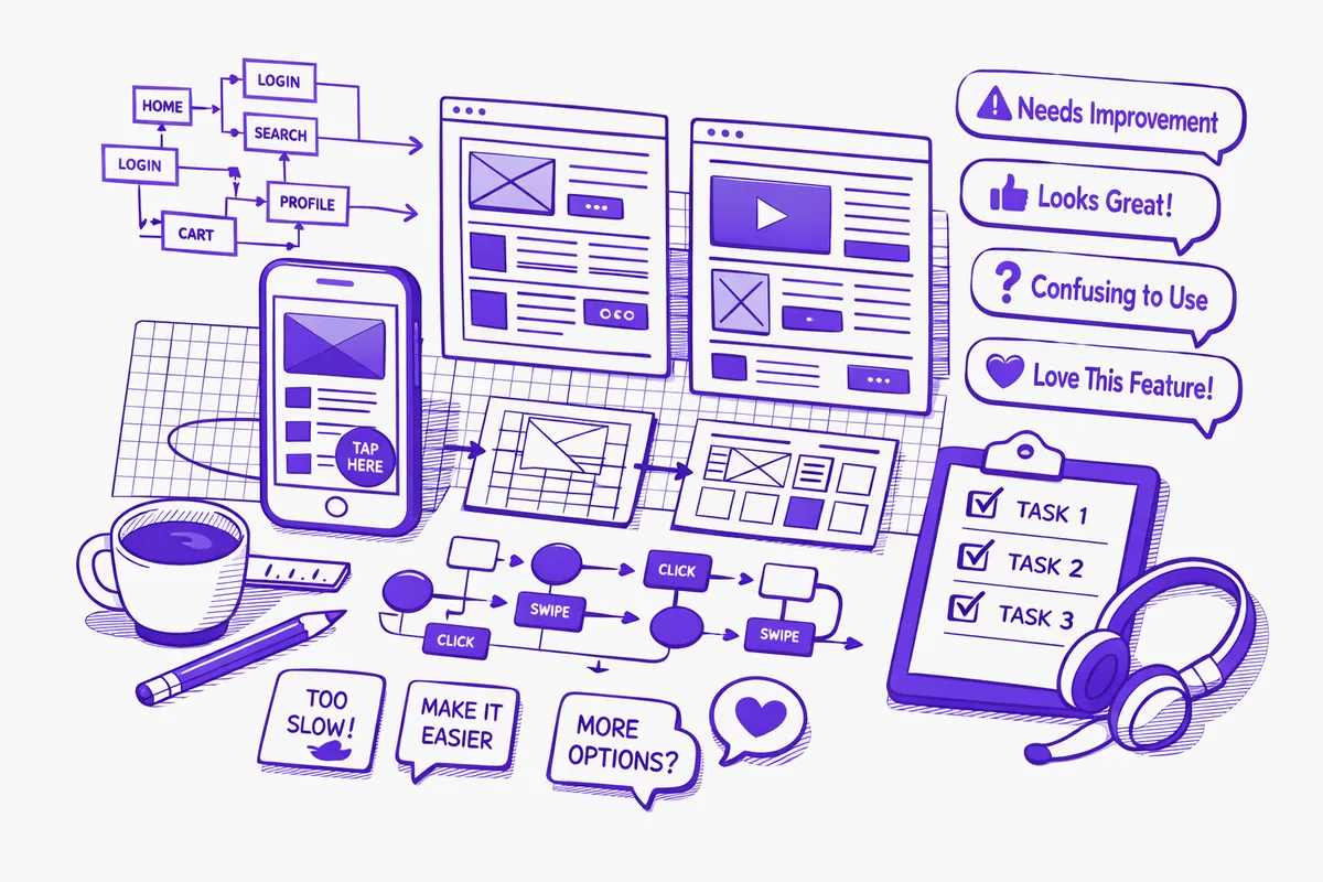
1. User research grounded in the actual Humboldt Park context. We conduct research using the methods appropriate to the project: user interviews, task analysis on real devices, analytics review, and competitive analysis of comparable interfaces. For community-serving organizations, we recruit research participants from the community rather than using assumed personas. The findings from this research ground every design decision that follows.
2. Information architecture and wireframes reviewed before visual design. The structure and interaction model of the interface is reviewed and approved before visual design work begins. This sequencing prevents the expensive mistake of investing in visual design for an interface that has structural problems. Wireframes for bilingual interfaces show both language versions.
3. Visual design system with component documentation. The visual design we deliver is not a collection of page mockups. It is a design system: documented components, spacing rules, typography scales, color usage guidelines, and interaction states. This system makes the design implementable without ambiguity and maintainable after the initial build without requiring the original designer.
4. Usability testing before handoff to development. We test the design with real users before it goes to the development team. This is the step that catches the navigation decision that made sense in Figma and confuses actual users, or the form validation message that reads clearly in English but not in Spanish. Fixing these issues in design is dramatically cheaper than fixing them in production.