How We Build Brand Identity for Humboldt Park
We begin with a deep conversation about the history and mission of the business. In Humboldt Park more than almost anywhere else in Chicago, the story behind the business matters to the community. Who started it, why, what it is trying to do, and what relationship it wants with the neighborhood are the source materials for a brand identity that will be taken seriously.
From that conversation, we identify the visual territory: the aesthetic references that resonate with the business owner's community, the colors and forms that carry appropriate cultural weight, the typography that signals the right combination of professionalism and warmth. We are not designing for a general Chicago audience. We are designing for the specific community that will walk past the sign on Division Street, see the Instagram profile, and decide whether this business belongs.
We develop two or three concept directions that explore different approaches to that brief. We present each with cultural context, not just visual reasoning. The question is not only which looks best but which belongs most genuinely.
Bilingual execution is built into the design process, not appended afterward. We design logotypes and brand marks that accommodate both English and Spanish text gracefully. We develop tagline options in both languages simultaneously, so neither is a translation of the other but both carry the same meaning and weight.
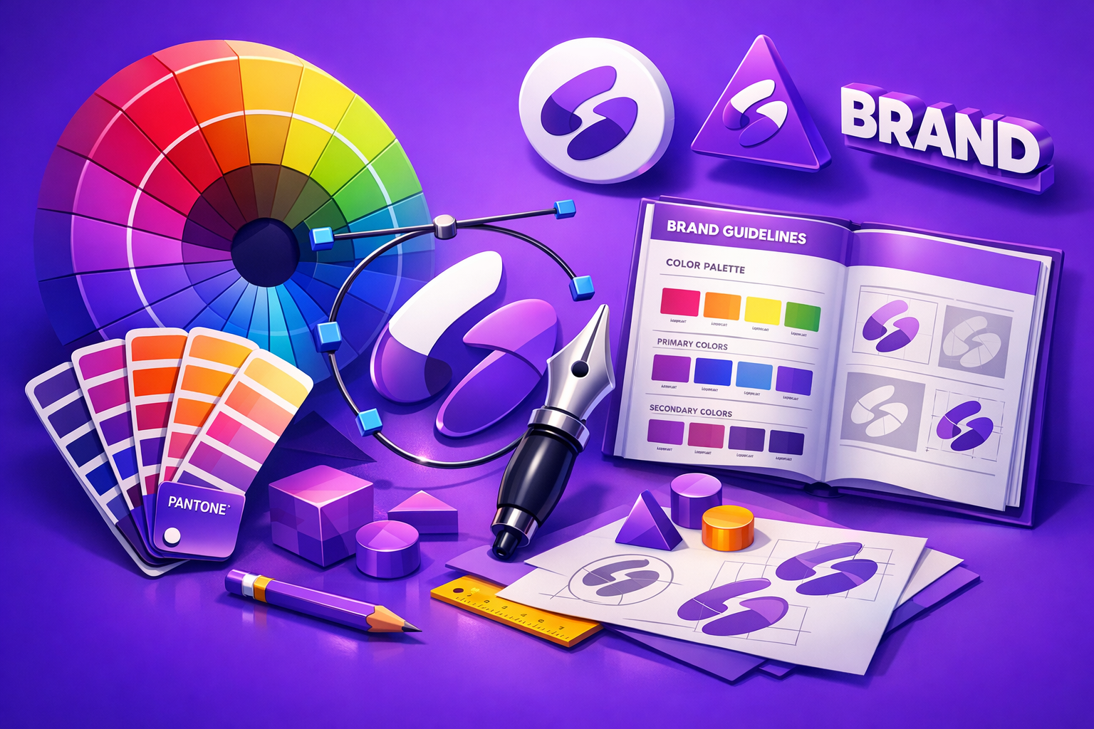
Delivery includes every format needed to operate in the neighborhood: high-resolution files for mural and sign vendors, print-ready files for packaging and materials, optimized files for social platforms, and a clear brand guide that community members helping the business with any design work can actually use.
Industries We Serve in Humboldt Park
Puerto Rican restaurants and food businesses along Division Street operate in one of Chicago's most culturally distinctive food landscapes. We design brand identities for these businesses that carry the specificity of Puerto Rican regional cuisine, family traditions, and community character without reducing them to generic Latin branding. The visual difference between a brand that says "Puerto Rican food" and one that says "Abuela's mofongo from Ponce" is significant.
Community health and wellness organizations near North Avenue and California Avenue serve a community with specific health needs and a history of underserved access. Brand identity for these organizations communicates trust, cultural competence, and accessibility, not corporate healthcare. The visual language must invite rather than intimidate.
Barber shops and hair salons on Paseo Boricua are cultural institutions as much as service businesses. Brand identity for these spaces needs to honor their role as community gathering points. We design salon and barbershop brands that communicate skill and belonging, with visual languages that speak to the Puerto Rican, broader Latino, and mixed communities that use these spaces.
Bike shops and active lifestyle businesses near Humboldt Park, the park itself and Western Avenue, serve a community with strong outdoor culture. We design active business brands that feel at home in the neighborhood without being generically sporty. The park, the trails, and the community's relationship to public space inform the visual vocabulary.
Independent coffee roasters and cafes in Humboldt Park often operate at the intersection of cultural identity and craft. We design coffee brand identities that balance the craft coffee aesthetic with authentic community connection, so the brand does not read as a gentrifier but as a neighbor who cares about quality.
Cultural organizations and nonprofits connected to institutions like La Casita and the National Museum of Puerto Rican Arts and Culture need brand systems that communicate mission, community, and cultural pride simultaneously. We design organizational brand identities that work across programming materials, signage, merchandise, and digital presence without losing coherence.
What to Expect Working With Us
1. Cultural grounding conversation. We spend real time understanding the cultural context and community relationship of your business before any visual work begins. This is not a questionnaire. It is a conversation about history, community, and purpose. The quality of this conversation determines the quality of the brand.
2. Concept development with cultural framing. We develop visual directions that are explicitly framed in cultural terms, not just presented as aesthetics. Each direction comes with an explanation of what it is communicating and to whom, so you can make an informed decision rather than just reacting to which one looks nice.
3. Bilingual refinement. Selected directions are developed with Spanish and English execution in parallel. We bring native Spanish fluency to the copywriting and cultural review process so no element of the brand contains a linguistic or cultural misstep.
4. Community-ready delivery. Final deliverables include every format needed for street-level presence in Humboldt Park: signage, print, mural-scale vector files, social platforms, and merchandise. We include a brand guide written in accessible language, not technical jargon, so community members helping the business can use it without training.