How We Build Brand Identity for Englewood
Discovery is the foundation. Before any design work begins, we spend significant time understanding the business: its founding story, its values, its clients, its aspirations, what distinguishes it from others doing similar work, and what emotional register it wants to hold in the community. For a community anchor business like a church, that register is different from a new food brand. For a solo barber building a loyal base, it is different from a community nonprofit. We do not apply the same framework to both.
Research follows. We look at the competitive landscape, the visual culture of the neighborhood and the industry, and the aesthetic references the business owner finds compelling. We are building something that is distinctive from what already exists, not derivative of it.
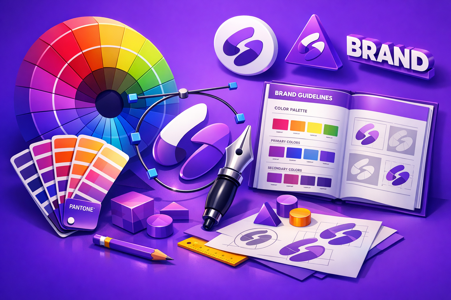
Logo design is produced as a primary mark with variants: a full lockup with name and tagline where applicable, an icon-only version for small use cases, horizontal and vertical arrangements for different layout contexts. Every variant is intentional and tested at multiple sizes from large signage down to app icon.
Color selection is deliberate, not arbitrary. Colors carry associations and have functional requirements: they need to work in print and on screen, in full color and in single-color contexts, on light and dark backgrounds. We build a palette that is distinctive and functional.
Typography selection follows the same logic. We choose typefaces that match the business's personality, work at every size where the identity will appear, and are accessible in both licensed and free versions so the business can extend its own materials over time.
We deliver a complete brand identity package with a usage guide that a non-designer can follow.
Industries We Serve in Englewood
Grassroots food and agriculture enterprises operating from Englewood soil need identities that communicate authenticity, care, and community connection. An urban farm brand that looks like it was designed for a Whole Foods private label misses the point entirely. We build identities for food businesses that reflect where the food comes from and who grows it, grounded in the visual language of the South Side.
Personal care businesses and barbershops on Halsted Street and Ashland Avenue often have strong informal identities, everyone in the neighborhood knows the shop, but no consistent visual system. We formalize that identity into a logo and visual system that carries the same recognition across digital and physical channels. A barber who has been cutting in Englewood for ten years has earned a brand that represents that tenure.
Community nonprofits and advocacy organizations need identities that communicate mission and credibility simultaneously. A well-designed identity for a community organization signals that the organization takes its work seriously enough to invest in how it presents that work. It also creates the visual consistency needed to produce effective program materials, grant applications, and public communications.
Churches and faith communities with long institutional histories sometimes operate with outdated visual identities that no longer represent who they are and who they serve. A refreshed identity that honors the institution's roots while presenting it clearly to current and prospective members reconnects the institution's visual presence with its present mission.
New businesses entering the Englewood commercial corridor on 63rd Street have a single opportunity to make a first impression. A strong brand identity on launch day tells the neighborhood: we are here, we are serious, and we are staying. That first impression, communicated through signage, social media, and printed materials, shapes how the community receives the business.
Home-based and e-commerce businesses founded by Englewood residents often lack the physical storefront that does early identity-building work for brick-and-mortar operations. For these businesses, brand identity is even more critical because the entire visual impression happens through digital channels. A strong logo and color system gives the business a professional presence before it has a storefront.
What to Expect Working With Us
1. Discovery interview and research. We spend sixty to ninety minutes in conversation about the business, its story, its community, and its visual aspirations. We follow that conversation with independent research into the competitive and visual landscape.
2. Identity concept presentation. We develop two distinct brand identity directions and present them with design rationale. Each direction includes logo concepts, color palette, and type selection. You choose the direction or give feedback that guides refinement.
3. Refinement and finalization. We refine the chosen direction through two revision rounds and produce final files across all variants. We test at every relevant size and context before delivery.
4. Brand identity package and usage guide. You receive a complete file package including every logo variant in PNG, SVG, and PDF formats, the color palette with hex and CMYK values, font files or links, and a plain-language usage guide covering the most common situations.