How We Build Brand Identity for Bridgeport
We start with a discovery process that takes the business's history seriously. How long have you been in Bridgeport? What were the original signs like? What do your best customers say when they describe you to a friend? The answers shape the identity direction before we touch a design tool.
From discovery, we develop a positioning brief that articulates what the business stands for in plain language: not marketing language, but the kind of sentence a neighbor would use. For a Bridgeport bar, that might be "the place you go before and after the game, and on the days there's no game." For a contractor, "the guy your cousin vouches for." For a gallery, "the space that takes artists from the neighborhood seriously." The visual identity follows from that positioning, not the other way around.
Logo design goes through two or three directions before we narrow to one. We show concepts in context: on a sign, on a business card, on a vehicle, on a phone screen. Bridgeport businesses often have signage that needs to work in physical space first. A logo that looks good on a screen but loses definition on a backlit sign is the wrong logo.
Color palette and typography are developed to match the logo's character and the business's use cases. A bar near Guaranteed Rate Field might use colors that read well in both daylight and under neon. A contractor needs typography legible on a yard sign at thirty feet. A gallery needs typefaces with enough editorial weight to carry an exhibition announcement.
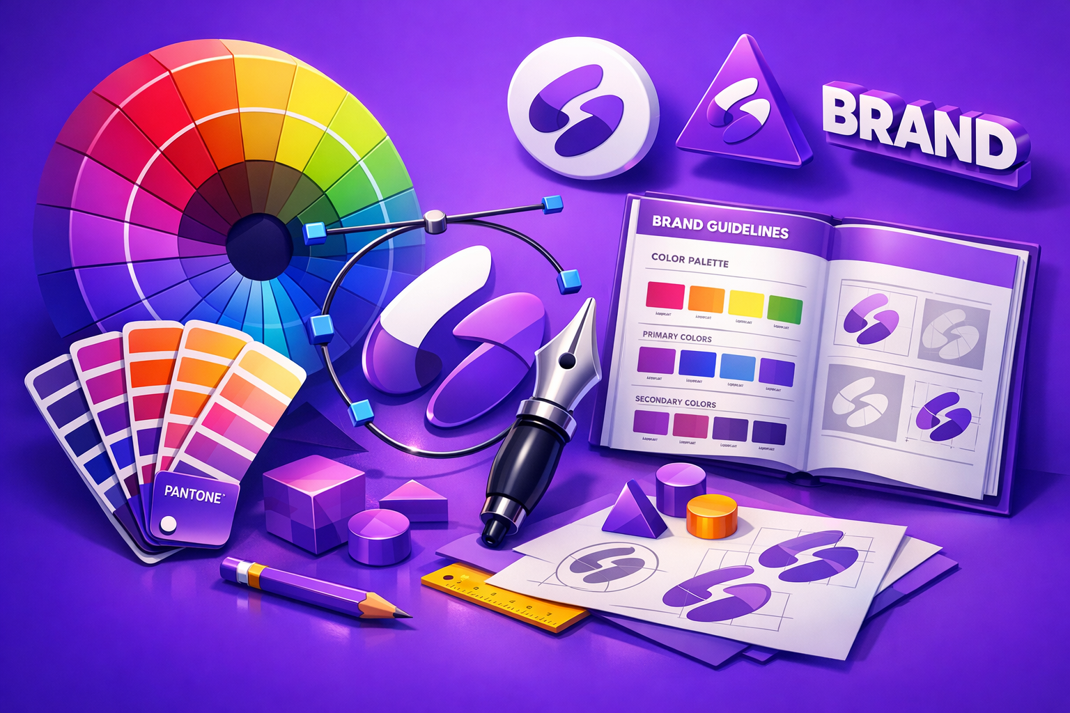
Delivery includes all source files, a brand guide with usage rules, and a set of basic applications your team can use immediately.
Industries We Serve in Bridgeport
Irish bars and neighborhood taverns near 35th Street and Halsted need identity that honors their history without becoming a parody of Irish-American iconography. We design logos and visual systems that project permanence, hospitality, and the specific character of a place where regulars have a seat that's theirs.
Chinese and Asian-owned restaurants and businesses along Archer Avenue serve a community that has been rooted in Bridgeport for generations, distinct from the Chinatown commercial corridor nearby. We develop identities that reflect that specific community context rather than defaulting to pan-Asian visual codes.
Latino-owned restaurants, shops, and services near 31st Street need brand identities that speak to their core community while also welcoming the broader neighborhood. We build identities that are specific without being exclusive, rooted without being narrow.
Small contractors and trades need a logo that works on a truck, a yard sign, a business card, and a t-shirt. Readability, durability, and a sense of competence are the primary design criteria. We build identities for trades businesses that make a referral feel like a sure thing.
Galleries and arts businesses in the Zhou B Art Center corridor need identities with enough visual sophistication to operate in the art world without losing their Bridgeport specificity. We design for the gallery context without defaulting to the generic minimalism that makes every art space look the same.
New businesses entering Bridgeport from outside the neighborhood need identities that earn trust from longtime residents rather than projecting an outside aesthetic onto the neighborhood. We help new owners understand what visual signals read as belonging and build from there.
What to Expect Working With Us
1. Discovery and positioning brief. A structured conversation about your history, your customers, your competitors, and what you want the business to feel like in ten years. We document the brief and share it with you before touching design tools. You approve the direction before we start.
2. Concept development and presentation. We develop two to three logo directions and present each in context: on signage, on a business card, in a digital format. Each direction is explained: why these forms, why this color, why this typeface. You choose a direction or we synthesize elements across directions.
3. Refinement and color/typography system. We refine the chosen direction through one or two revision rounds, then develop the full color palette and typography system. Every element is tested in the applications your business actually uses.
4. Final delivery and brand guide. You receive all source files (vector, PNG, PDF), a practical brand guide with usage rules and examples, and a basic set of applications (business card layout, letterhead, social profile image). The guide is written for someone who is not a designer.