How We Build UI/UX Design for Beverly
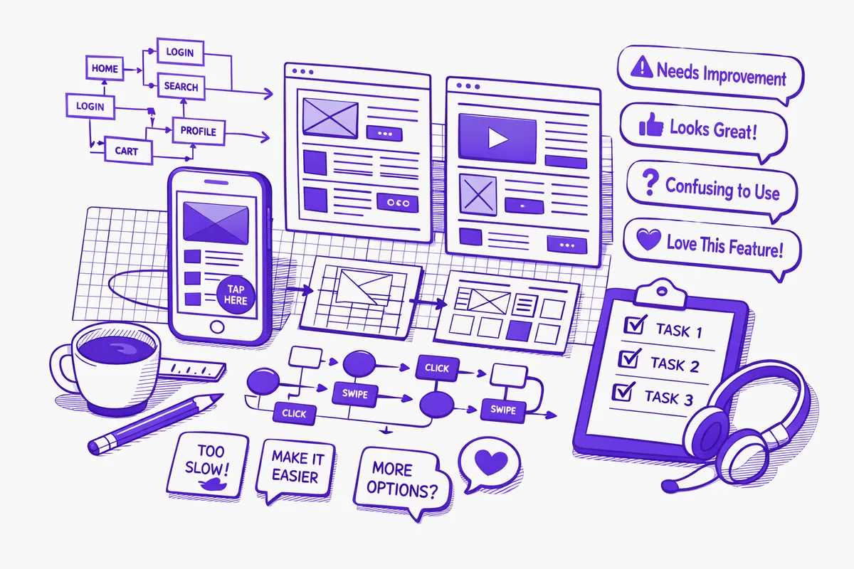
UX design for Beverly professional services begins with the client's journey, not the firm's organizational structure. We map what a new client needs to do from first contact through signed engagement agreement. At each step, we document the friction: what is confusing, what requires a phone call to complete, and where the process drops people who would otherwise become clients. Each friction point is a design problem.
For a medical practice near Ridge Park, the journey map looks different. The new patient flow from online discovery through completed intake through first appointment is typically three to five friction points in most practices: phone verification that could be done online, duplicate information collected at multiple stages, insurance details captured in a way that requires the patient to look things up under time pressure, and intake forms that are PDF attachments rather than online forms. Each of those is a fixable UX problem.
We prototype before we build. Every significant interface change is tested with representative users from Beverly's actual client demographic before anything is coded. For a law firm on 103rd Street, that means testing with professional adults in their 40s and 50s who are not technology natives but are sophisticated professionals. For a student-services interface connected to St. Xavier University, it means testing with a user profile that is comfortable with mobile-first interfaces. The user demographic is specific to Beverly's context, not an abstract persona.
Visual design is the last phase, not the first. The interface structure, the information hierarchy, and the interaction model are validated through wireframes and prototypes before we apply the firm's visual identity. A beautiful interface with a flawed information architecture is still a flawed interface. We get the structure right first.
Industries We Serve in Beverly
Estate and family law practices along 95th Street handle matters of significant personal consequence: wills, trusts, estates, divorces, and the legal architecture of family wealth. The client portal for a Beverly law firm should communicate the same gravity and professionalism as the firm's conference room. Document upload that is clear and secure, matter status that is honest and plain-language, billing that is transparent and detailed, and communication that does not require a phone call for every simple question. That is a UX problem, and it is solvable.
Medical and dental practices near Ridge Park and Walker Branch Library can reduce no-show rates, improve intake data quality, and lower front-desk call volume with better patient portal UX. New patient intake redesigned to be completable on a phone in eight minutes, appointment reminders with one-click confirmation, and a prescription refill request flow that does not require a patient to remember their portal password all produce measurable improvements in practice efficiency and patient satisfaction.
CPA and financial advisory offices on 111th Street handle document collection during tax season with the same recurring friction every year. A UI/UX redesign of the client document portal, the tax preparation workflow status page, and the billing and payment interface turns tax season client communication from a support burden into a self-service experience. Clients who can see exactly what has been received, what is missing, and what questions need answering without calling the office are less anxious and less likely to call.
Insurance agencies along Western Avenue interact with clients at renewal time and at claim time: the two highest-stakes moments in the relationship. A renewal portal that presents coverage clearly, offers side-by-side comparison of renewal options, and makes it easy to confirm or modify coverage without a phone call serves Beverly clients better than an email with a PDF attachment. A claims intake form that guides the client through the information needed without overwhelming them builds confidence rather than anxiety at a moment of stress.
Boutique retailers and specialty shops near the Beverly Arts Center with online stores live and die on checkout UX. Cart abandonment is almost entirely a UX problem: friction in the checkout flow, unexpected shipping costs, confusing form fields, or a payment step that does not inspire trust. A UX redesign of a Beverly boutique's checkout flow commonly reduces abandonment by 20 to 30 percent, which is recovered revenue from shoppers who were ready to buy but encountered friction at the last moment.
Neighborhood restaurants and hospitality businesses near Horse Thief Hollow and the 103rd Street commercial corridor handle reservation and private event booking through interfaces that vary widely in quality. A reservation flow that is clear on every device, that gives customers confidence their booking is confirmed, and that captures the information the restaurant needs to prepare for the guest (occasion, dietary restrictions, preferred seating) without being intrusive serves the Beverly dining community better than a generic booking widget.
What to Expect Working With Us
1. User journey mapping and friction audit. We document the complete journey a Beverly client, patient, or customer takes through your digital interface, from first contact through completed transaction or ongoing relationship management. We identify every step that creates friction, requires phone or email support to complete, or results in drop-off. The friction audit produces a prioritized list of UX improvements with estimated impact for each.
2. Wireframe and information architecture design. We design the structure of every screen and interaction before adding any visual design. Wireframes are tested with representative users from Beverly's actual demographic before we proceed. A 55-year-old professional near Longwood Drive uses a law firm portal differently than a 28-year-old recent St. Xavier graduate uses a mobile scheduling app. The testing reflects the real user.
3. Visual design and prototype. Working from approved wireframes and your existing visual identity, we apply the full visual design layer and build an interactive prototype that feels like the real interface. Beverly professional services firms review and approve the prototype before a line of production code is written. Changes at the prototype stage cost a fraction of what they cost after development.
4. Implementation support and usability monitoring. We provide design specifications and assets for your development team or work directly with our development partners to implement the designs. After launch, we track usability metrics: task completion rates, drop-off points, support ticket patterns, and user feedback. The first 60 days after launch typically surface two or three adjustments that the prototype could not predict, and we address those quickly.