How We Build UI/UX Design for Albany Park
Our design process starts with the user, not the screen. Before any wireframes are drawn, we document who will use this interface: their language preferences, their device types, their primary task, and the context in which they are likely to be using it. For an Albany Park immigration law firm, the user might be a non-English-speaking client accessing a case status portal from an older Android phone during a break at work. That profile produces very different design decisions than a native English speaker on a laptop.
We work through information architecture before visual design. Where does each piece of content live, how does the user navigate between sections, and what is the single most important action on each screen? For a medical practice near Horner Park, the most important action is scheduling an appointment or calling. The design makes that action visually prominent and immediately accessible, not buried below a hero image and clinic history.
Multilingual UI design requires decisions that monolingual design does not. Where does the language switcher live? How do you handle the fact that Korean text strings are often shorter than English equivalents while Arabic strings can be longer? How does a right-to-left layout interact with your navigation structure? We design for these variations from the start, testing each language version at every stage.
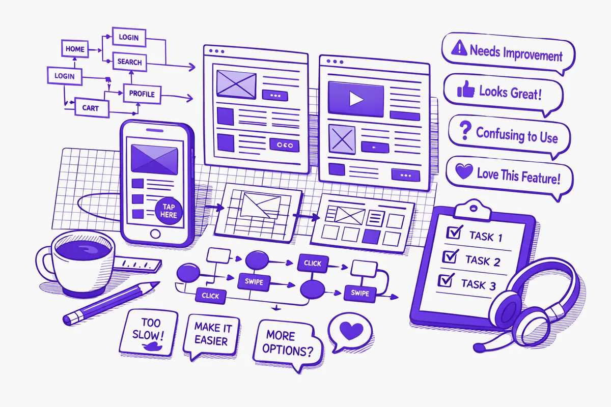
We produce wireframes for all key screens, walk through them with you, incorporate feedback, and move to visual design. The development handoff includes annotated design files specifying spacing, typography, color values, interaction states, and behavior rules for every component. Development builds from the specification, which is the only way to ensure the live product matches what was approved.
Industries We Serve in Albany Park
Immigration law firms near Kedzie Avenue manage a client experience that begins with anxiety and must move toward confidence. The UI/UX design challenge is making an inherently complex process feel navigable. A well-designed intake form that asks one question at a time, shows the client their progress through the process, and uses clear plain-language instructions in the client's language reduces form abandonment and produces more complete, accurate intake submissions than a long single-page form crammed with legal terminology.
Korean specialty grocers and food importers on Lawrence Avenue who have invested in e-commerce need product catalog interfaces that reflect the actual shopping behavior of Korean-speaking customers who are browsing by product category, brand, and import origin. A design that mirrors the information hierarchy your customers use to make purchasing decisions, rather than a generic Shopify template arranged by default, produces better add-to-cart rates and fewer abandoned sessions.
Medical practices and community health clinics near Horner Park serve patients who may be accessing a patient portal or appointment booking interface in a language they are less comfortable with than their native language. UX design for these interfaces prioritizes clarity, brevity, and error prevention over comprehensiveness. A patient who makes a mistake on an intake form because the field labels were ambiguous creates downstream problems for the clinical staff. Well-designed field labels, helpful error messages in the patient's language, and confirmation steps before final submission prevent the errors that create administrative rework.
Auto repair shops between Pulaski Road and Kimball Avenue benefit from service estimate request interfaces that collect the right vehicle and service information without feeling like a bureaucratic form. A UX design that guides the customer through vehicle identification, service description, and scheduling preference as a conversation rather than a form produces higher completion rates and more accurate service estimates than a form with eight blank fields and no guidance.
Community organizations and social service nonprofits near the Albany Park Library often manage interfaces that serve both program participants and funders. A participant seeking case management needs a simple, multilingual interface. A foundation program officer reviewing grant outcomes needs data visualization and export tools. UI/UX design that correctly separates these user types prevents the compromises that result from trying to serve both audiences from a single design.
Taquerias and restaurants on Pulaski Road competing for online ordering need interfaces that guide customers from menu to checkout in under three minutes on a mobile phone. Every additional tap, every unclear label, and every step that requires scrolling back to correct a selection is friction that increases abandonment. Restaurant ordering UX has established best practices that most sites built on generic templates have not implemented.
What to Expect Working With Us
1. User research and task mapping. We document the primary users of the interface, their goals, their devices, their languages, and the context in which they are likely to be using it. For Albany Park businesses, this phase includes specific attention to multilingual use cases not visible in research conducted only in English. We identify the three to five primary tasks users need to complete and design the interface to make those tasks fast and error-free.
2. Information architecture and wireframes. We produce low-fidelity wireframes for every key screen showing content hierarchy, navigation structure, and primary actions without committing to visual design. For businesses on Lawrence Avenue with multilingual requirements, wireframes include annotations for how each screen behaves in each configured language. Wireframe review identifies structural issues before they are baked into a visual design.
3. Visual design and multilingual testing. We produce the high-fidelity visual design and test it across the device types your users are most likely to use, always including real Android devices. Multilingual versions are tested for visual correctness at this stage so the development handoff specifies the exact behavior expected in each language.
4. Development handoff and implementation review. We deliver annotated design files with specifications for every component, interaction state, and layout variation. If we are also building the interface, we verify the live implementation against the approved design before delivery. If you have a separate development team, we provide specifications in a format they can work from and are available for questions during implementation.